VisDeck
What is VisDeck?
VisDeck is a physical card deck for designing information visualizations. Instead of guessing which chart to use, you build a visualization by placing cards on a table: each card represents one design decision — the question you're answering, the data you have, the visual marks you'll use, and how you'll encode values in those marks.
Cards connect through a port-and-symbol system printed on their edges. If the symbols don't match, the design is invalid — the cards tell you before the instructor does.
Your goal is not to find the right chart. It is to build a design you can explain and defend: What am I trying to see? How am I encoding the data? What does this reveal? Why is this a good choice?
During evaluation, you walk through your card layout with the instructor. What matters is the quality of your reasoning, not the chart you chose. Playing a risky technique and explaining the trade-offs well demonstrates more skill than playing a safe chart with no justification.
The Deck at a Glance
The deck contains 155 distinct card designs across 10 categories. A few high-demand cards — Position, Quantitative, and Categorical — include extra copies for multi-channel and multi-attribute configurations, bringing the physical deck to 160 cards.
Anatomy of a Card
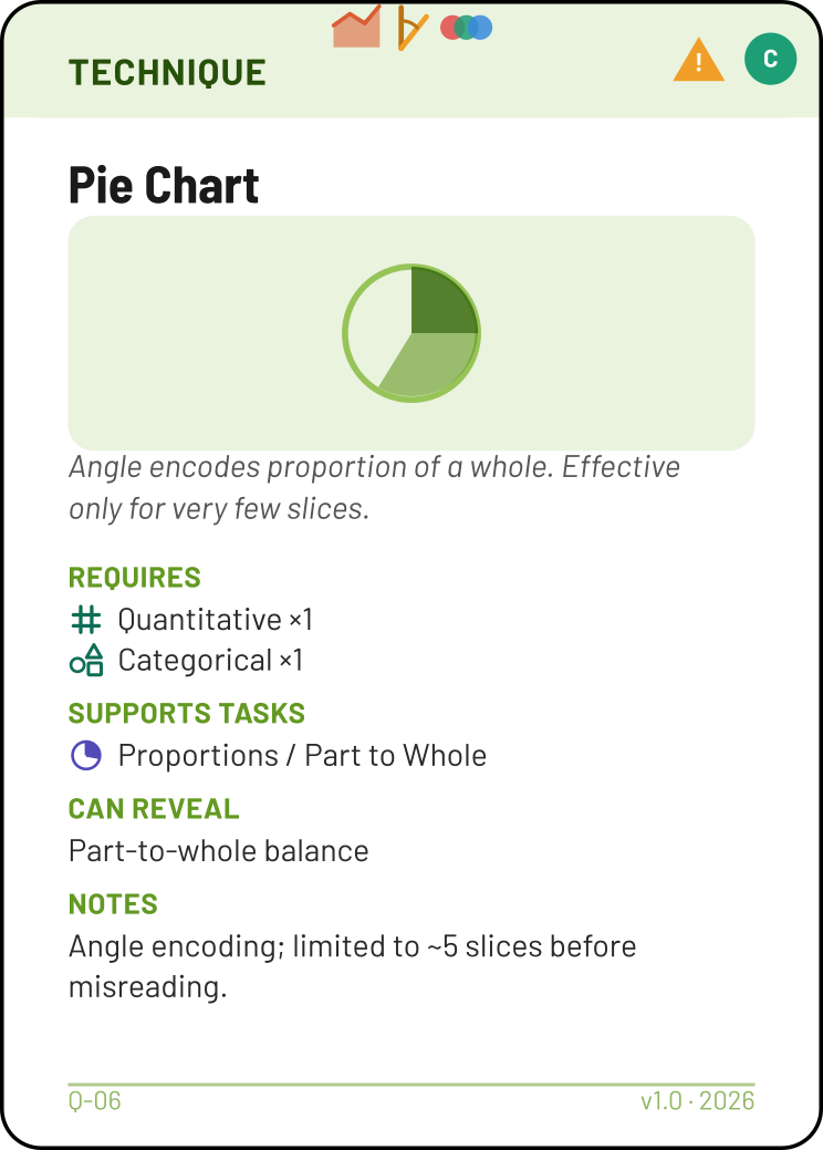
Every card in the deck follows the same visual structure. Here is a Technique card (Pie Chart) as an example — it has all the key elements, including a warning triangle. Other categories use the same anatomy, though their sections and ports differ.
 1
2
3
4
5
6
7
8
9
1
2
3
4
5
6
7
8
9
Connection points along the top edge. On this Technique card, they show the required Mark + Channel combination (Area + Angle + Color Hue).
Coloured band identifying the card type — Task (purple), Attribute (teal), Mark (coral), Channel (amber), Technique (green), and so on.
Amber triangle with "!" (when present). This card requires a specific Principle card to be legally played — see Warning Cards.
Filled circle showing the rarity tier: C Common, U Uncommon, R Rare, M Mythical.
The card's title — a task name, attribute type, mark type, chart name, etc.
Visual representation of the concept on a tinted background.
Brief italic text explaining what the card represents.
Structured information specific to the card type — required attributes, supported tasks, accuracy rank, notes, etc. See Reading Card Sections for details.
Card ID (e.g. Q-06) and deck version number.
Card Categories
Each category has a distinct colour and serves a specific role in the design process.
| Category | Cards | Role in the design |
|---|---|---|
| Task | 13 | Your analytical question. What am I trying to understand? Always the first card you place. |
| Attribute | 8 | The data type of a variable in your dataset — numeric, categorical, temporal, geographic, etc. Connect to the Task's side ports. |
| Transform | 4 | A data operation applied before encoding: Aggregate (values → summary), Bin (continuous → intervals), Rank (values → ordinal positions), or Fit / Model (data → fitted values + uncertainty). Sits between an Attribute and a Channel. |
| Mark | 5 | The geometric shape representing each data item: Point, Line, Area, Link/Edge, or Text. |
| Channel | 9 | The visual property that encodes a data value: Position, Length, Size, Colour, Shape, etc. Connects a Mark to an Attribute. |
| Technique | 63 | A named chart type (Bar Chart, Scatterplot, Treemap, …). Validates your assembled Mark + Channel combination — if the technique's top ports don't match your stack, the design is invalid. |
| Layout | 10 | A composition operation applied to a technique: stack, group, overlay, facet, overview+detail, focus+context — plus combining two techniques on one canvas or draping one over a background image. Layouts create variants like Stacked Bar Chart, Small Multiples, or a dot map. |
| Emerging Pattern | 9 | A pattern you expect the visualization to reveal — Trend, Clusters, Outliers, etc. Placed after assembly, justified by domain knowledge. |
| Principle | 21 | A design rule that justifies a choice or covers a warning card. Place next to the element you're justifying. |
| Interaction | 13 | A user behaviour that wraps your completed technique: Details on Demand, Filtering, Sorting, Linking / Coordinated Views, etc. |
Rarity Tiers
Every card has a coloured pip in its top-right corner showing its rarity tier. Each tier is a strict superset — it includes all cards from the tiers below it.
| Tier | Pip | Cards | What it adds |
|---|---|---|---|
| Common | C | 50 | Core concepts. 6 tasks, 4 attributes, 4 marks, 5 channels, 8 techniques (Bar Chart, Line Chart, Scatterplot, Heatmap, Dot Plot, Pie Chart, Boxplot, Item List). Fully self-contained — you can build valid designs with Common cards alone. |
| Uncommon | U | 101 | Spatial data, distributions, small multiples, the Link/Edge mark, more channels (Size, Shape) and interactions (Brushing, Pan / Zoom, Annotation, Linking / Coordinated Views). Adds Histogram, Area Chart, Slopegraph, Treemap, Choropleth, node-link Graph, and more. |
| Rare | R | 143 | Domain-specific techniques (Parallel Coordinates, Chord Diagram, Fan Charts, Sankey, …). The Uncertainty attribute, and the Texture and Motion channels. Requires expert justification. |
| Mythical | M | 155 | Controversial or expert-only (Spirals, Cartogram, Word Tree, Space-Time Cube). Almost always carries a warning. |
Your instructor will tell you which tiers are in play for each activity. Counts above are cumulative — the Uncommon tier includes all 50 Common cards plus 51 more.
Warning Cards
Some cards carry an amber warning triangle in the header strip, next to the rarity pip. These represent design choices known to be problematic — inaccurate encodings, distortive layouts, or techniques prone to occlusion.
A warning card is only legal if its specified covering Principle card is on the table alongside it. But simply placing the Principle card is not enough — you must provide a concrete explanation of why the trade-off is acceptable for your specific design and dataset. The Principle card opens the door; your reasoning walks through it.
| Warning card(s) | Required Principle |
|---|---|
| Pie Chart, Radar Chart, Radial Barchart, Nightingale Rose, Packed Bubble Chart, Tagcloud | Prefer More Accurate Channels |
| Streamgraph, Cartogram, Overlay (Layout — summary mark on a shared ruler) | Don't Distort the Truth |
| Bullet Chart | Avoid Chartjunk |
| Parallel Coordinates, Space-Time Cube, Overlay (Layout — overlapping instances or colliding labels) | Avoid Occlusion |
| Glyphs | Graphical Imprecision |
| Technique Combination (Layout) | Proximity |
| Background Reference (Layout) | Respect Data Topology |
For example, playing Pie Chart with Prefer More Accurate Channels and explaining "I chose angle because my dataset has only three categories with widely different proportions — the comparison is unambiguous at this level" demonstrates nuanced understanding. Merely placing the Principle without such reasoning does not make the play valid.
Overlay appears in two rows on purpose. It is covered by either Don't Distort the Truth or Avoid Occlusion — whichever matches the actual risk of your design. A mean line sharing a value ruler with bars is a distortion risk (the first); a multi-line chart whose series cover each other, or labels that collide, is an occlusion risk (the second). Play the Principle that names the danger you are actually managing.
The Port System
Ports are the small symbols printed along the edges of cards. They are the grammar of the deck — they tell you what connects to what.
Different types of ports represent different concepts. Some represent attribute types — for instance,  marks a Quantitative connection, while
  marks Categorical. Others represent marks —
  for Point,
  for Line,
  for Area. Still others represent channels —
  for Position,
  for Length. Two cards connect when their adjacent port symbols match.
How to Read Ports
Filled symbol = required. The connection must be made for the design to be valid. For example, on the Compare Values task card, the side ports show a filled and a filled — you must provide both a Quantitative and a Categorical attribute.
Underlined symbol (with a dashed line beneath) = optional. You may connect it if your data has that type, but you don't have to. For example, the Locate (spatial) task card shows a filled  Geographic port (required), plus underlined Quantitative and Categorical ports — useful if your map data has those, but not mandatory.
Symbols close together (tight cluster) = AND — all must be present. For example, a Scatterplot's top edge shows packed tightly together. This means the Scatterplot requires a Point mark with two Position channels — all three must be present in your assembled stack.
Symbols spread apart (with visible space between) = OR — pick one or more. For example, the Compare Values task card's bottom edge shows  spread across the edge. This means you can use an Area mark, a Point mark, a Line mark, or a Text mark for this task — your choice.
Reading Card Sections
Different card types contain different body sections. Here is what to look for on each, presented in the order you encounter them during the design flow.
Task cards
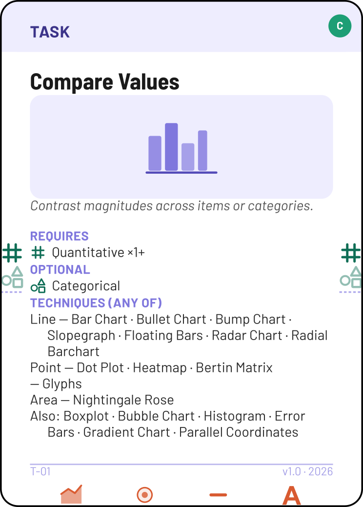
Task cards show which attribute types are Requires (you must provide these) and which are Optional (connect only if your data has them and they add analytical value). These correspond to the filled and underlined ports on the card's side edges.
The Techniques section lists all chart types that serve this task, grouped by mark. Primary techniques — the ones designed specifically for this task — appear first. Secondary techniques (shown as "Also: …") can also serve this task in certain contexts. Use this section to survey your options after assembling your Mark + Channel combination.
The bottom edge shows which mark types work for this task (OR-options, spread apart). Start here when choosing a Mark in Step 4.
Attribute cards
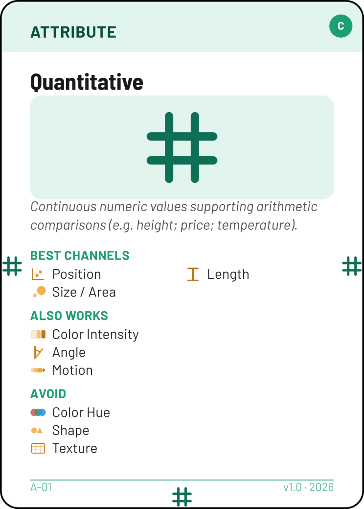
Attribute cards list which channels are Best channels, which Also work, and which to Avoid for this data type. Use this when choosing channels in Step 5 — it tells you which encodings are perceptually effective for your data.
Every edge carries the attribute's own type symbol, so it connects to any card that accepts that symbol.
Transform cards
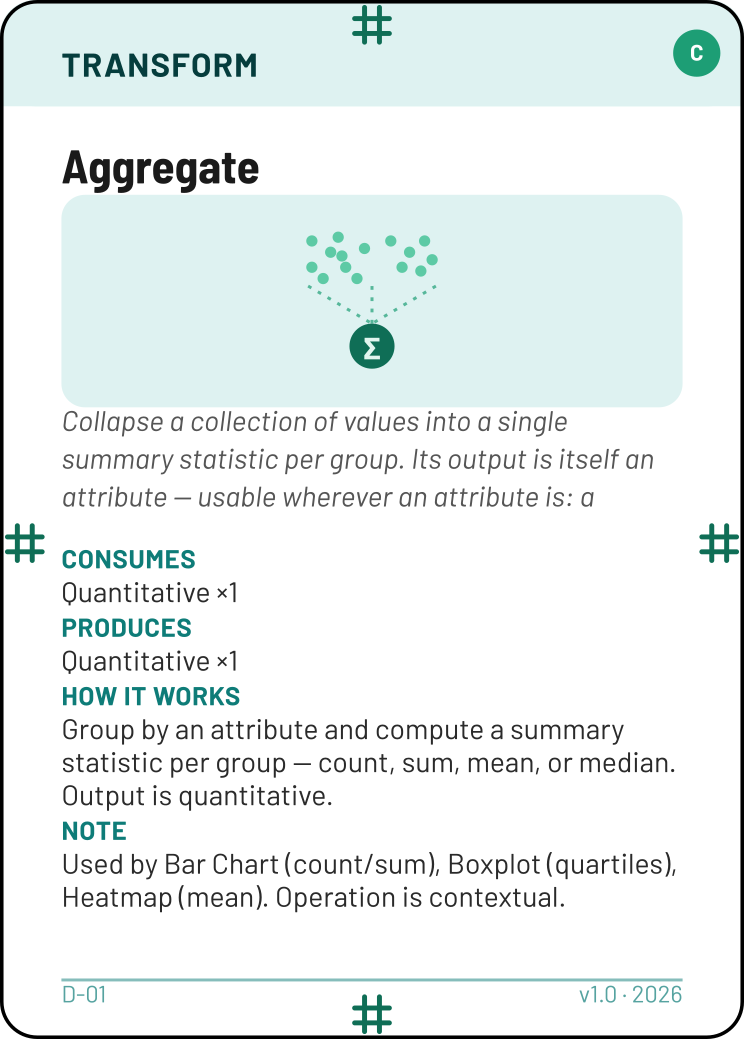
Transform cards show what goes in (top port) and what comes out (bottom and side ports). Consumes lists the input attribute types; Produces lists the output. Because the output appears on the sides too, a Transform behaves like an attribute generator — its product plugs in wherever an Attribute card could, including a Channel below or a Task's required side port. The How it works section explains the operation.
Mark cards
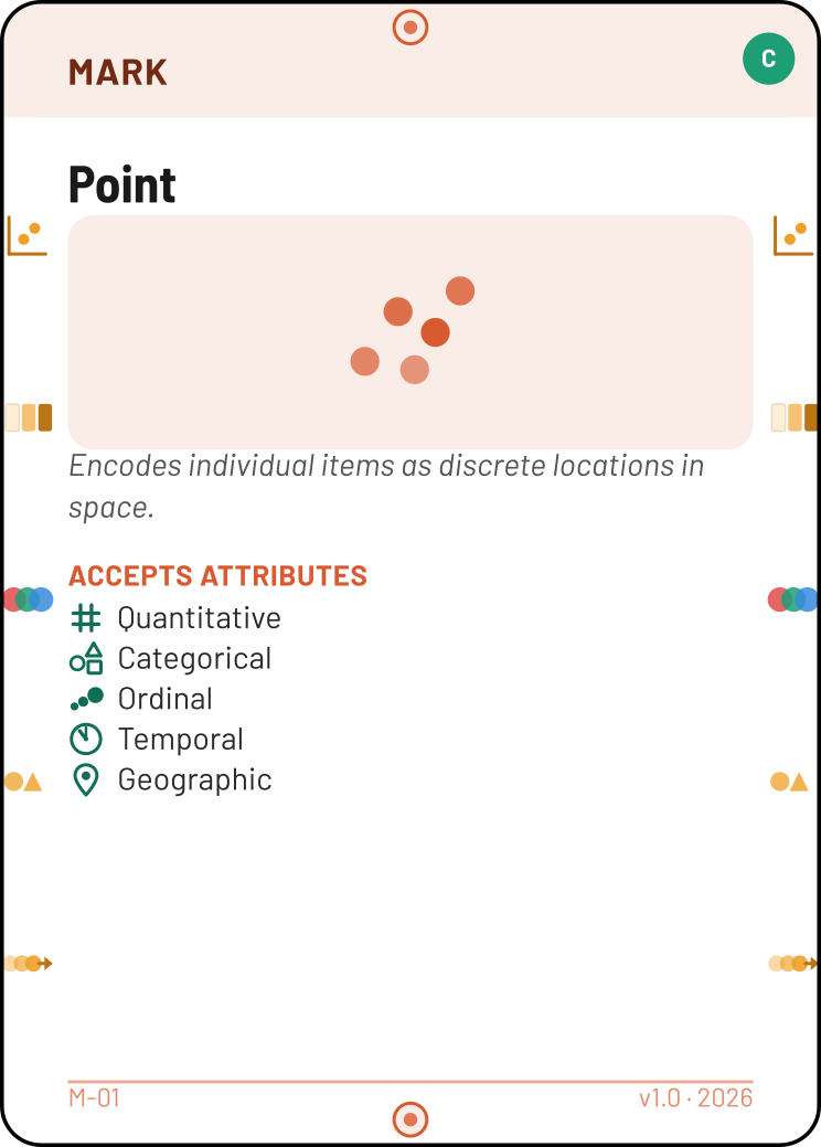
Mark cards list which channels they accept on their left and right side ports, and which attribute types the mark can represent. Use this to verify that your chosen channels are compatible before attaching them.
Top and bottom edges carry the mark's own symbol, which must match the corresponding port on a Technique card.
Channel cards
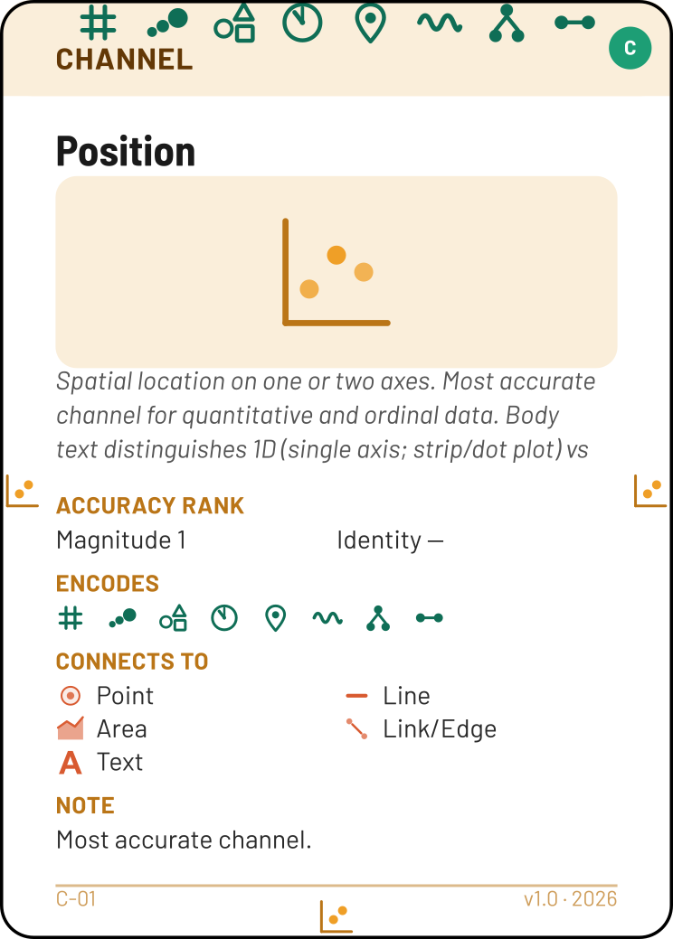
Channel cards show their Accuracy rank (lower = more accurate), which attribute types they Encode, and which marks they Connect to.
The top-edge ports are the attribute types this channel supports — each is an independent OR-option. A channel's top port must match the attribute card (or Transform output) it's encoding. The bottom and side ports carry the channel's own symbol, which must match a port on the adjacent Mark card.
Technique cards
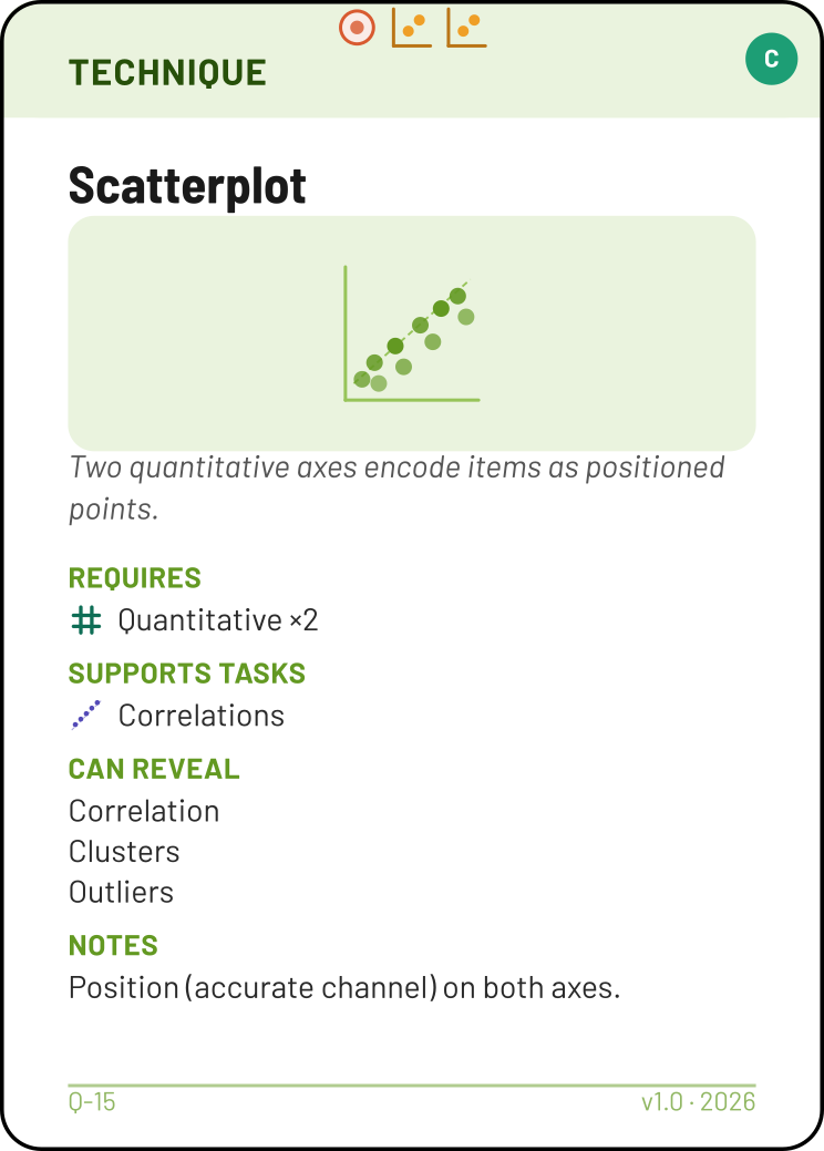
Technique cards are validators. Their top-edge ports show the exact Mark + Channel combination the technique requires — if your assembled stack doesn't match, the design is invalid.
Some techniques call for more than one mark (Error Bars: Line + Point). Then each channel in the top cluster binds to whichever placed mark accepts it — a channel is satisfied if at least one mark accepts it. A couple of techniques (Map, Glyphs) carry no mark at all; there's simply no mark to match.
Requires lists the attribute types needed, with counts (e.g. "Quantitative ×2" means two quantitative variables). This is also a hard constraint — even if the top ports match, the design is invalid if the required attributes aren't present.
Supports Tasks lists which analytical questions this technique is designed to answer. Confirm that your Task card appears here.
Can Reveal lists patterns this technique can surface — but this is the technique's capability, not a prediction about your data. You still need to justify each pattern with domain knowledge (see Step 8).
Layout cards
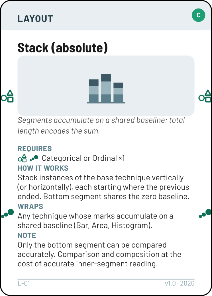
Layout cards wrap an existing Technique to create a variant. How it works explains the spatial arrangement. Wraps lists which techniques this layout can modify. Most layouts also Require a Categorical attribute — the variable that creates the groups, stacks, or facets.
Side ports (when present) show the required attribute type.
Emerging Pattern cards
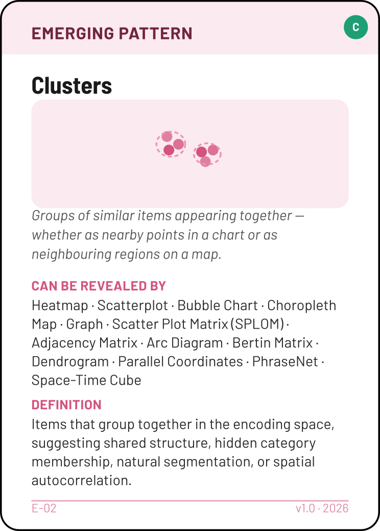
Pattern cards contain a Definition of the pattern and a Can be revealed by section listing techniques capable of surfacing it. Use this to check that your chosen technique can actually reveal the pattern you expect.
No Clear Pattern is a first-class card — it signals you've examined the data and found no strong expectation, which is a valid and sophisticated stance.
Principle cards

Principle cards state a Rule, explain When to play, and (if applicable) list which Required for warning cards they cover. They have no ports — place them beside the card or design choice they justify.
Interaction cards

Interaction cards explain How it works (the mechanism), which techniques they Wrap, and include a Note on when the interaction is most valuable. They have no ports — place them beside the technique they enhance.
Rules of the Game
These are the constraints that govern a valid play. Use them as a checklist before your oral walkthrough.
The Design Flow
Work top to bottom. Each step narrows the design space until you reach a valid, justified configuration.
Choose a Task
What am I trying to understand about this data?
Pick one Task card that matches your analytical goal. Read the question you're trying to answer and find the task that frames it.
| If you want to… | Consider… |
|---|---|
| Rank or compare magnitudes across categories | Compare Values |
| See how values spread across a range | See Distributions |
| Find relationships between two numeric variables | Correlations |
| Track how something changes over time | Evolution of Value |
| Find what proportion each part contributes to a whole | Proportions / Part to Whole |
| Look up a specific value | Lookup / Retrieve Value |
| Show confidence intervals or ranges | Show Uncertainty |
| Find unexpected deviations over time | Detect Anomaly Over Time |
| Find cycles or recurring structures | See Repeating Patterns |
| Find where things are on a map | Locate (spatial) |
| Compare values across geographic regions | Compare (spatial) |
| Reveal how items are connected in a network or hierarchy | See Structure |
Tip — task vs. question phrasing. Your question might use comparison words ("which year has the best sales") even when the data is temporal. The attribute type you play should match how you're using the variable in your analysis, not just what the variable "is" in the raw data. Two valid paths exist:
(a) If you care about the temporal ordering — "how did sales evolve, and which peak stands out?" — play Temporal and use Evolution of Value. The peak answers "which year" as a byproduct.
(b) If you genuinely don't care about order — "which year had the highest sales, treating years as labels?" — play Categorical and use Compare Values. Cite Data Semantics Matter to acknowledge the deliberate retyping.
Both paths are defensible. When there's a gap between what the data is and how you're using it, that's exactly the kind of tension a Principle card surfaces.
Tip — one task per stack. Each visualization design answers one task. If your dashboard question needs two analytical perspectives (e.g. "compare values AND correlate two variables"), build two stacks and connect them (see Multi-Task Dashboards below).
Tip — Compare Values comes in two flavours. Most of the time you compare magnitudes across categories — one Quantitative and one Categorical, giving a Bar Chart or Dot Plot. But you can also compare one item across many attributes — three or more Quantitatives at once — which is what a Radar Chart or Parallel Coordinates does. That's why those two ask for ≥3 Quantitative cards instead of a Quantitative + a Categorical. Both readings are legitimate "comparison"; pick the one that matches your question.
Identify Attributes
What data variables does this task need?
Look at the Task card's left and right edges. You'll see port symbols — some filled (required), some underlined (optional). Place one Attribute card per variable in your dataset. Every filled port on the Task must be matched by an Attribute card of the corresponding type.

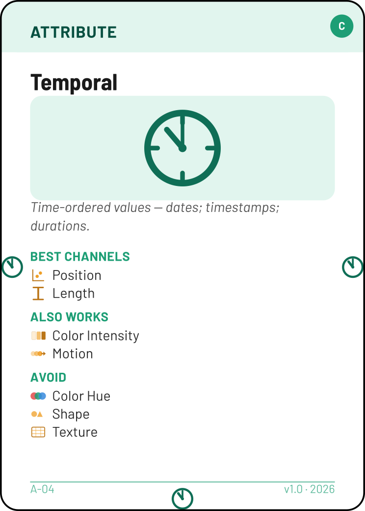
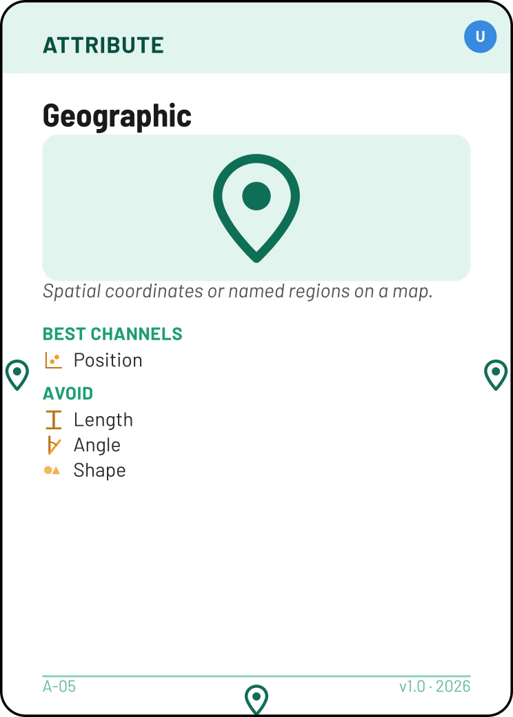
Tip — the same attribute type can appear more than once. A Correlations task needs two Quantitative variables (e.g. price and rating). Use two copies of the Quantitative card, one per data field. Write the field name on a sticky note next to each card. Geographic is the exception: a single Geographic card already carries both spatial axes (longitude and latitude), so one card fills the two Position channels of any map — you never play it twice for the two axes.
Apply Transforms (if needed)
Does my raw data need to be transformed before I can visualize it?
Aggregate — collapses many values into one summary per group: count, sum, mean, median, or any other summary function. Use Aggregate when your data has one row per item but your visualization needs one value per category. It can also compute multiple derived measures at once — for instance, a Boxplot uses Aggregate to produce the five-number summary (min, Q1, median, Q3, max) from raw values, all represented by the single Quantitative port at the bottom of the card.
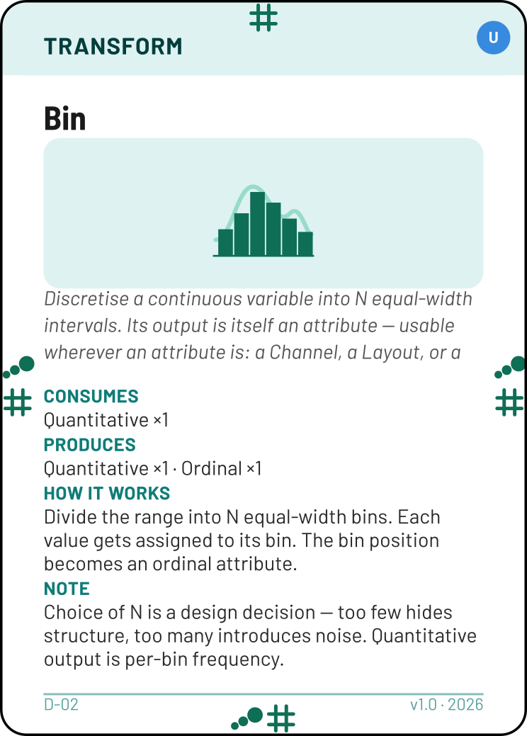
Bin — divides a continuous variable into equal-width intervals. Use Bin when your technique requires discrete intervals from continuous data (e.g. Histogram needs price ranges, not individual prices).
The Transform's top edge shows what goes in; the bottom and side edges show what comes out — the output carries the produced attribute's own symbol, so it docks downward to a Channel or sideways to a Task's (or Layout's) port, exactly like an Attribute card. Usually you place a Transform between the Attribute it transforms and the Channel below; when a Task requires an attribute your data doesn't have, the side output lets the Transform feed that required port directly. Bin turns Quantitative into Ordinal (and also hands you a per-bin count). Aggregate keeps Quantitative as Quantitative (a mean is still a number). Rank turns Quantitative into Ordinal; Fit / Model turns it into a fitted Quantitative plus an Uncertainty.
Tip — a Transform's output can fill a required port. What a Transform produces behaves exactly like a fresh Attribute card: it can plug into a Channel, a Layout, or even a Task's required port. This is how you build a Confidence Interval Regression for the Show Uncertainty task without owning a measured Uncertainty attribute — Fit / Model produces the Uncertainty, and that produced Uncertainty fills the task's required Uncertainty port (see Example E).
Tip — do I need Aggregate? Ask yourself: "Does my chart show individual items or summary values?" Scatterplot = one dot per item → no Aggregate. Bar chart showing average per category = one bar per group → Aggregate. Histogram = bars showing frequency per bin → Bin (not Aggregate).
Tip — what about filtering? Subsetting is data preparation — handle it before you touch the deck (R9). Note the subset in your walkthrough. The Filtering interaction card is for a different purpose: a runtime control that lets the end user dynamically filter.
Choose a Mark
What geometric shape best represents each data item?
Look at the Task card's bottom edge — it shows which mark types work for this task (OR-options, spread apart). Pick the mark that best suits your data and question.
| Mark | Port | Typical use |
|---|---|---|
| Point | |
Individual items positioned in space — dots, circles, symbols |
| Line | |
Trends, connections, and bars (yes — bars are Lines!) |
| Area | |
Filled regions — proportions, distributions, map regions |
| Link/Edge |  |
Arrows or arcs between nodes — network connections, flows |
| Text | |
Words or labels — item lists, tag clouds |
Some techniques require more than one mark. Error Bars (Q-25), for instance, needs both a Point (the central estimate) and a Line (the uncertainty range) — it isn't optional, both must be placed. Put down every mark the technique calls for, and make sure each one is among the task's bottom-port options. At validation, each channel attaches to whichever of the placed marks accepts it — a channel counts as satisfied as long as at least one of the placed marks accepts it, not necessarily all of them.
Tip — a couple of techniques have no mark. Map and Glyphs don't take a mark from the task's bottom edge. A Map is a backdrop — you attach another technique's marks to it (see How Do I Build It?). A Glyph is one composite mark, with its sub-shapes encoding the attributes internally. For these two, just skip the mark-picking step.
Important — bars are Lines, not Areas. A bar chart's value is encoded by the length of the bar, not by its area. The width is just layout. This is why Bar Chart, Histogram, and Floating Bars all use the Line mark. If this feels strange, imagine replacing each bar with a horizontal line at its top — the chart still works.
Add Channels
How will I visually encode each data variable?
Channels are the visual properties that carry information. Attach Channel cards to the Mark card's left and right ports. When you have a choice, prefer the channel higher in the accuracy ranking.
Each channel card must satisfy two connections: its bottom/side port symbol must match a port on the adjacent Mark card, and its top ports must include the attribute type of the variable it's encoding. For instance, if you're using a Line mark and want to encode a Quantitative variable (say, mean grade) on the y-axis, you could choose Length — its side port matches the Line mark's accepted channels, and its top ports include Quantitative.
Channels for quantitative data (Magnitude rank — lower is more accurate)
| Rank | Channel | Port | Example |
|---|---|---|---|
| 1 | Position | | x-axis, y-axis, map location |
| 2 | Length | | Bar height |
| 3 | Angle |  | Pie slices |
| 4 | Size / Area |  | Bubble size |
| 5 | Color Intensity |  | Heatmap cells |
| 6 | Motion |  | Animation |
Channels for categorical data (Identity rank — lower is more accurate)
| Rank | Channel | Port | Example |
|---|---|---|---|
| 1 | Color Hue |  | Category colours in a scatterplot |
| 2 | Shape |  | Dot shapes (circle, triangle, square…) |
| 3 | Texture |  | Print patterns — hatching, dots |
| 4 | Motion | | Category-specific animation |
Two axes = two Position cards. For any chart with an x-axis and a y-axis (scatterplot, line chart, heatmap), play two copies of the Position channel card.
Size / Area doesn't go on Points. The Size / Area channel attaches only to Area, Link/Edge, or Text marks — a Point has no Size port. To size symbols by value (a bubble chart), use the Area mark, not a Point with an added Size channel. Likewise Shape attaches only to Points, and Texture only to Areas.
Color Hue is for categories only. Never use Color Hue for numeric or ordered data. A rainbow gradient on a numeric scale violates Expressiveness. Use Color Intensity instead.
Not every attribute maps to a Channel card. Some are encoded structurally by the technique itself — by mark multiplicity (a Waffle Chart's filled-cell count), by an arrangement that isn't a placed channel (a Tag Cloud's word sizes, a Treemap's nesting), or by text labels (a contour map's values). When you bring such an attribute, expect it to have no Channel card beneath it, and be ready to explain how the technique encodes it.
Validate with a Technique
Does a named chart type match what I've assembled?
Find a Technique card whose top-edge ports are all matched by your Mark + Channel combination. Every defining port the Technique lists must be present; you may have extra channels beyond them (R10).
For example, if you assembled Line + Position + Length, look for a Technique whose top reads . That's the Bar Chart.
If you assembled Point + Position + Position, look for . That's the Scatterplot.
If no Technique matches, your design is invalid. Go back and adjust your Mark or Channel choices.
Beyond the top ports, also check the Technique's Requires section — the required attributes are a hard constraint too. A Technique that requires Quantitative ×2 will not validate a stack that only has one Quantitative attribute, even if the top ports otherwise match.
When two techniques both fit, the most specific one wins. Say you've built a Bar Chart (Line + Position + Length) and you also have an uncertainty value to show. Attach a Color Intensity channel to the Line mark to encode it — the stack now also satisfies the Gradient Chart, so that card should be used instead.
The extra channel must be one your mark legally accepts (see R10). A Line takes Color Intensity, so this promotion is legal. A Point, by contrast, has no Size port — which is why you can't turn a scatterplot into a bubble chart by "adding size." A Bubble Chart uses the Area mark instead.
Tip — check the Supports Tasks section. Confirm that your Task is listed in the Technique's "Supports Tasks" section. If it isn't, the technique might not be well-suited to your analytical goal.
Tip — some techniques use multiple marks. Error Bars use Line + Point; Confidence Interval Regressions use Line + Area. Place both mark cards and match the combined symbol cluster on the Technique's top edge.
Wrap with a Layout (if needed)
Should I compose this technique into a richer arrangement?
Layout cards wrap an existing Technique to create variations. A Bar Chart wrapped in Stack (absolute) becomes a Stacked Bar Chart. The same chart wrapped in Group becomes a Grouped Bar Chart. Wrapped in Small Multiples, it becomes a faceted display.
| Layout | What it does | Requires |
|---|---|---|
| Stack (absolute) | Segments accumulate on a shared baseline; total = sum | Categorical ×1 |
| Stack (100%) | Segments normalised to 100%; shows proportions | Categorical ×1 |
| Group | Side-by-side instances sharing a baseline | Categorical ×1 |
| Diverge | Two-direction layout around a central axis | Categorical ×1 |
| Overlay | N instances on the same axes, distinguished by colour | Categorical ×1 |
| Small Multiples | Same chart repeated per subset, shared scale (faceting) | Categorical ×1 |
| Overview+Detail | Miniature overview alongside a zoomed detail panel | — |
| Focus+Context | Magnified focus area with compressed surroundings | — |
| Background Reference | Drape the chart over a custom background image (floor plan, schematic) so its Position channels gain real-world meaning | — |
| Technique Combination | Two different techniques share one canvas (e.g. Map + Scatterplot = dot map) — see How Do I Build It? | — |
Most layouts require a Categorical attribute to split the data by — this is the variable that creates the groups, stacks, or facets. Overview+Detail, Focus+Context, Background Reference, and Technique Combination compose rather than split, so they need no extra attribute.
Tip — layout choice reveals different patterns. A stacked bar chart emphasizes part-to-whole relationships (play Part-to-whole Balance). A grouped bar chart emphasizes comparison across categories. Small multiples enable clean comparison across many groups. The layout is a design decision worth defending.
State Expected Emerging Patterns
What do I expect this visualization to reveal, and why?
You are designing a visualization, not reading one. Place Emerging Pattern cards to declare what you expect a viewer to see once the data is plotted — and explain why, based on domain knowledge about your dataset.

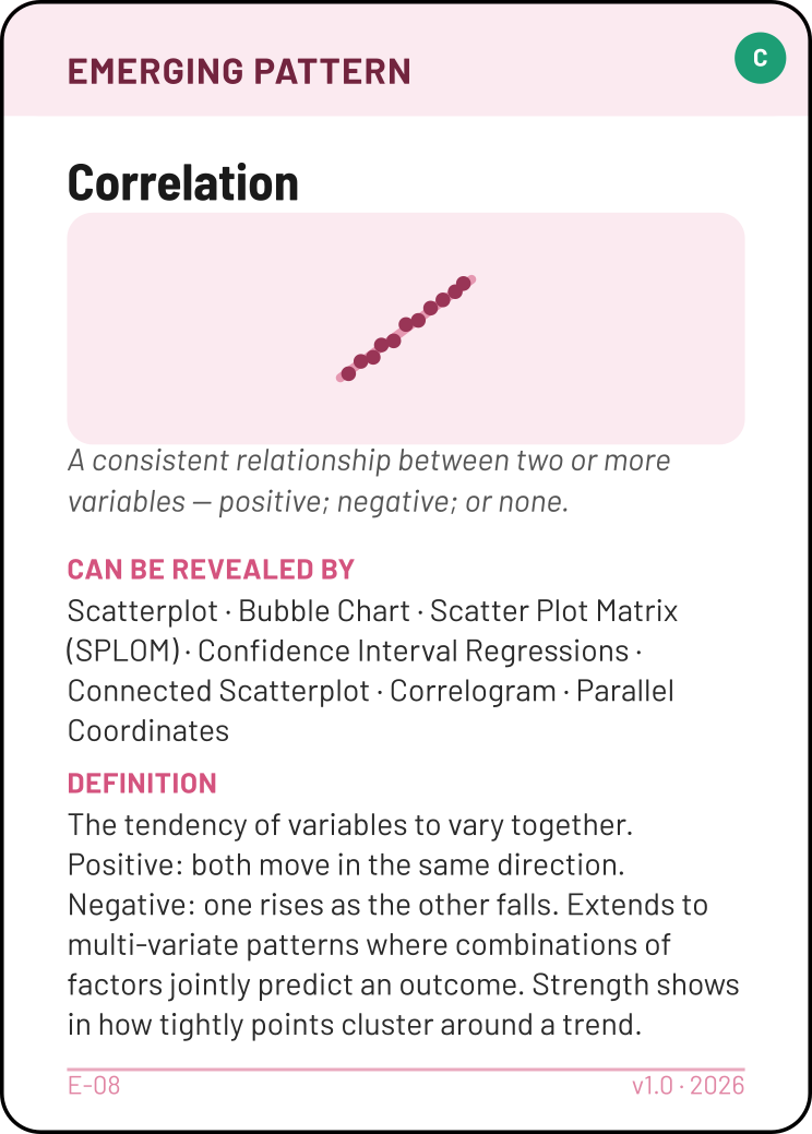
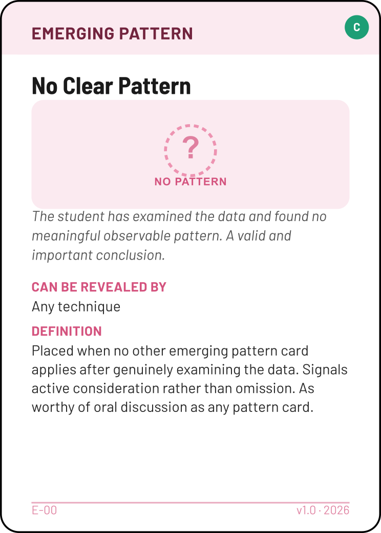
Do not parrot the Technique card. Every Technique card lists what it "Can Reveal." That list describes the technique's capability, not a prediction about your data. You must bridge the gap: "Scatterplot can reveal Correlation, and I expect to see it here because price and quality are typically related in consumer goods."
Do not force a pattern. If you have no reason to expect any specific pattern, place No Clear Pattern and explain what you considered. This demonstrates analytical maturity — you're designing for open-ended discovery.
Multiple patterns are fine. A boxplot comparing distributions might reveal both Spread (groups vary differently) and Outliers (some items are extreme). Play every pattern you can argue for with domain knowledge.
Justify with Principles
Where are the tensions in my design?
Principle cards appear on the table only when there is something to justify. A straightforward design with no trade-offs needs no Principles — the card assembly already shows the reasoning.
Mode 1 — Covering a warning card. Any card with an amber warning triangle requires a specific Principle to be legally played (see the Warning Cards table above).
Mode 2 — Justifying a deliberate exception. Play a Principle when you knowingly deviate from its rule, and explain why. Examples:
- Prefer More Accurate Channels: "I used Color Intensity instead of Position because I needed both Position channels for the two spatial axes."
- Don't Distort the Truth: "I'm truncating the axis to 80–100% because punctuality rates need to show small differences — a zero baseline would make all bars visually identical."
- Data Semantics Matter: "I'm treating year as Categorical because the question asks 'which year' not 'how does it evolve.'"
Playing Don't Distort the Truth to justify a deliberate truncation demonstrates deeper understanding than mechanically starting every axis at zero.
If your board has no Principles, that can be fine — it may mean you made standard choices with no trade-offs to flag. But be prepared to demonstrate this. The instructor may ask "Why no principles?", and "because my design is straightforward — no tensions" is only a good answer if you can walk through each decision and show there truly are none. It is not a shortcut to avoid thinking about trade-offs.
Add Interactions
How will users explore this visualization?
Interactions define how users engage with the visualization at runtime. They wrap your completed technique — they never stand alone.
| Interaction | What it does |
|---|---|
| Details on Demand | Clicking or hovering a mark reveals all attribute values for that item |
| Selection / Highlight | Selected marks stay full opacity; all others dim |
| Brushing | Drag-select a region; highlights propagate to linked views |
| Filtering | Show only items meeting a condition (range slider, checkbox, search field) |
| Pan / Zoom | Magnify a region and navigate within it |
| Search / Query | Type or select a value; matching item is highlighted or scrolled into view |
| Reconfiguration | User changes which attribute maps to an axis or channel |
| Reencoding | Changing the visual encoding type while keeping data fixed |
| Sorting | Reorder marks by value to reveal rank structure |
| Annotation | Text or shape overlays calling out specific marks or regions |
| Linking / Coordinated Views | Selection in one view updates all linked views sharing the same data |
| Drill-down / Roll-up | Navigate up and down a hierarchy by expanding or collapsing levels |
| Elide | Automatically hide less-important items by computed relevance |
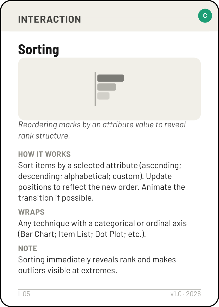
Tip — Sorting is often essential, not optional. If your question asks "which has the most" or "which has the fewest," Sorting a bar chart immediately reveals the answer.
Tip — Filtering as data prep vs. as interaction. If you pre-filtered your data (R9), mention it in your walkthrough but don't play Filtering. Play the Filtering interaction card only when you want the end user to control a dynamic filter at runtime.
Worked Example
Dataset: student grades
Variables: student name (Categorical), course (Categorical), grade (Quantitative, 0–20)
Question: How do grades compare across courses?
Task
"Compare across courses" → Compare Values. Required ports: Quantitative (filled) + Categorical (filled).
Attributes
Grade = Quantitative (fills the port). Course = Categorical (fills the port). Both required ports filled. ✓
Transform
The dataset has one row per student per course. To compare courses, we need one value per course — the mean grade. Play Aggregate (mean) between Quantitative and the channel below. The output is still Quantitative (a mean is still a number).
Mark
Compare Values bottom edge shows: . Among these options, the Line mark suits our comparison goal — it supports encoding magnitude along an axis, which is what we want when comparing values across categories.
Channels
Course on the x-axis → Position. Position supports Categorical ( appears in its top ports), so it can encode our Categorical attribute. ✓
Mean grade as bar height → Length. Length supports Quantitative ( appears in its top ports), which matches the Aggregate output. ✓
Both channels are top of the magnitude ranking — Position is rank 1 and Length rank 2 — and both are accepted by the Line mark's side ports. ✓
Technique
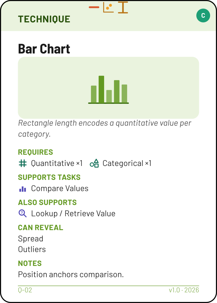
Our assembled stack is Line + Position + Length. We look for a Technique whose top ports match: . That's Bar Chart. The top ports match our Mark + Channel combination. ✓
Checking the hard constraints: Bar Chart requires Quantitative ×1 and Categorical ×1 — we have both (Quantitative via Aggregate, Categorical for course). ✓ Primary task: Compare Values — matches our Task. ✓
Layout
No layout needed — a simple bar chart without grouping or stacking serves the question directly.
Expected Patterns
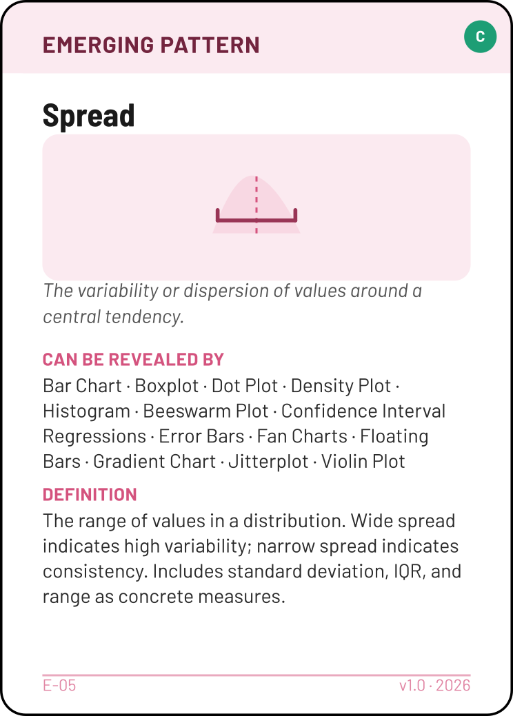
Course averages will likely vary — some courses are harder than others — so we expect Spread. And if one course (say, Physics) is known to have notably lower grades, that would stand out as Outliers. Both justified by domain knowledge about grade distributions in engineering programmes.
Principles
No Principles on the table. We used Position and Length (the two most accurate magnitude channels, ranks 1 and 2) and the y-axis starts at zero — standard, correct choices. We can walk through each decision and confirm there are no trade-offs or tensions to flag.
Interactions
Sorting — sort courses by mean grade to immediately reveal the ranking. Details on Demand — clicking a bar reveals the exact mean, count, and other values.
The board
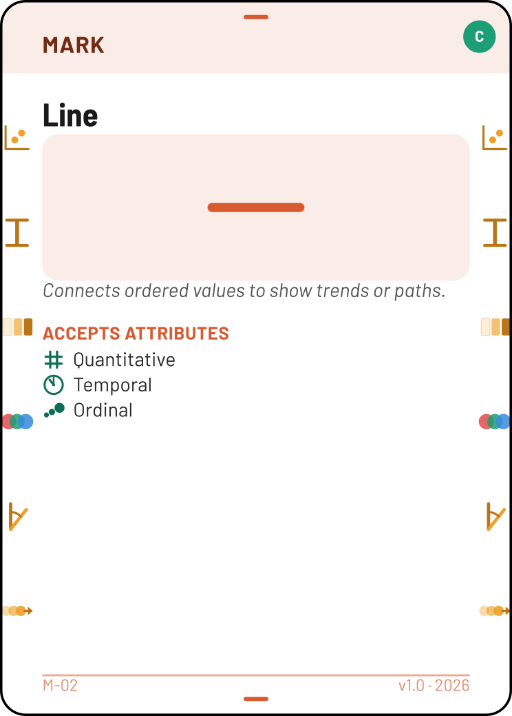
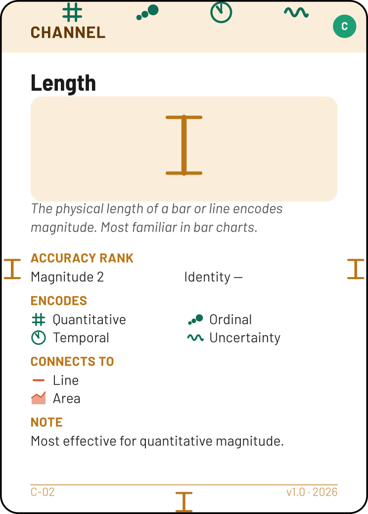
Oral walkthrough (what you'd say)
"I'm comparing mean grades across courses, so I played Compare Values. Grade is Quantitative, course is Categorical — both required ports are filled. I aggregate to get one mean per course. The task's bottom edge offers Area, Point, Line, and Text as valid marks. Line suits my comparison goal — it lets me encode magnitude via length along an axis. For channels, I chose Position for the x-axis (it supports Categorical, matching my course attribute) and Length for the y-axis (it supports Quantitative, matching the Aggregate output). Both are top-of-the-ranking magnitude channels (Position 1, Length 2). This combination — Line + Position + Length — matches the Bar Chart technique. The required attributes (Quantitative ×1, Categorical ×1) are both present, and Compare Values appears in the Supports Tasks section. I expect to see Spread because course difficulty varies across an engineering programme, and Outliers because courses like Physics typically have lower averages. No Principles on the table — I can walk through each choice and confirm there are no tensions: most accurate channels, zero-baseline, no exceptions. Sorting by grade reveals the ranking immediately."
Multi-Task Dashboards
Real dashboards answer more than one question. When your dataset serves multiple analytical tasks, build one stack per task and connect them.
How it works
- Build your first task stack (Task → Attributes → Mark → Channels → Technique). Validate it.
- Photograph it, then keep the Technique card on the table as a placeholder. Reclaim the Attribute, Mark, and Channel cards.
- Build the second stack using the reclaimed cards. Validate and photograph.
- Place both Technique cards on the table. Between them, place Linking / Coordinated Views. Above the Linking card, place the shared Attribute card (annotated with the domain field name) — this is the variable that bridges both views. If both views share an axis range, place Use Common Scale beside the set.
You don't need both full stacks on the table simultaneously — the photograph and the Technique placeholder are the evidence. But the linking layout (step 4) should be visible during your walkthrough.
Linking is key. The shared Attribute bridges both views. If users should be able to select in one view and see it highlighted in the other, play Linking / Coordinated Views. If both views need the same axis range, play Use Common Scale.
Dashboard example
Dataset: Student survey
Variables: course (Categorical), grade (Quantitative, 0–20 scale), study hours per week (Quantitative)
Questions: "Is there a relationship between study hours and grades?" + "How do grades compare across courses?"
View 1 — Scatterplot
Task: Correlations. Requires Quantitative ×2 (grade + study hours).
Mark: Point — one dot per student.
Channels: Position (x-axis, study hours) + Position (y-axis, grade). Both are the rank-1 magnitude channel, both support Quantitative.
Technique: Scatterplot — top ports match Point + Position + Position. ✓
Pattern: Correlation — domain knowledge: more study hours typically correlates with higher grades.
Interaction: Details on Demand — a tooltip showing the student's name, course, grade, and hours when hovering or clicking a dot.
View 2 — Bar Chart
Task: Compare Values. Requires Quantitative ×1 + Categorical ×1 (mean grade per course).
Transform: Aggregate (mean) on the grade attribute.
Mark: Line — bars encode magnitude via length.
Channels: Position (x-axis, course — supports Categorical) + Length (y-axis, mean grade — supports Quantitative). Position is rank 1, Length rank 2.
Technique: Bar Chart — top ports match Line + Position + Length. Required attributes: Quantitative ×1, Categorical ×1. ✓
Pattern: Spread — course difficulty varies across the programme.
Interactions: Sorting — reveals the grade ranking across courses. Selection / Highlight — clicking a bar dims all others, making it easy to compare one course against the rest.
Connecting the views
The shared attribute is course (Categorical). Selecting a bar in the Bar Chart highlights all students of that course in the Scatterplot → play Linking / Coordinated Views. Both views show grade on the y-axis, so they must use the same scale (0–20) → play Use Common Scale.
The dashboard board
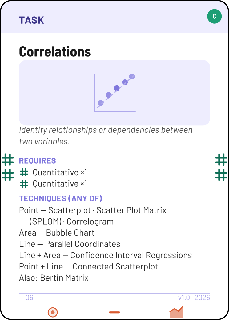

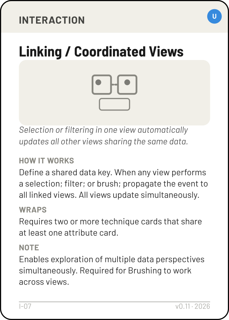
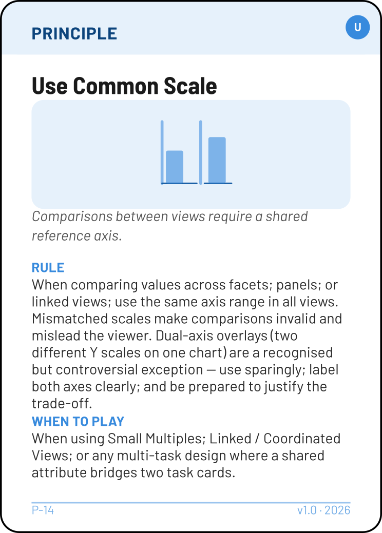
"The dashboard answers two questions. View 1 is a Scatterplot of study hours vs grade — I played Correlations with two Quantitative attributes and two Position channels. I expect Correlation because more study time typically associates with higher grades. View 2 is a Bar Chart of mean grade by course — I played Compare Values, aggregated grade per course, and used Position + Length. I expect Spread because some courses are harder. Both views share the grade axis at the same 0–20 range, so I played Use Common Scale. I placed Linking / Coordinated Views between both technique cards with the shared Categorical attribute (course) above it — clicking a course bar highlights those students in the scatterplot, letting a viewer drill into why a course's average is where it is."
Additional Examples
These examples illustrate less obvious design decisions — layouts, geographic data, hierarchies, justified trade-offs, and an attribute manufactured by a Transform. Each is presented in summary form; use the Worked Example above as a model for your own oral walkthrough.
A — Revenue by product line (Stacked Area Chart)
Dataset: Quarterly revenue by product line
Variables: quarter (Temporal), product line (Categorical), revenue in M€ (Quantitative)
Question: "How has total revenue evolved, and what is each product line's contribution?"
| Step | Decision |
|---|---|
| Task | Evolution of Value — tracks change over time. Requires Temporal ×1, Quantitative ×1. |
| Attributes | Temporal (quarter), Quantitative (revenue), Categorical (product line — for the Layout). |
| Mark | Area — filled regions show cumulative volume. |
| Channels | Position (x-axis, quarter — supports Temporal) + Position (y-axis, revenue — supports Quantitative). Color Hue distinguishes product lines. |
| Technique | Area Chart — top ports: Area + Position + Position. ✓ |
| Layout | Stack (absolute) — requires Categorical ×1 (product line). Segments accumulate, showing both total and per-line contribution. |
| Patterns | Trend (revenue growing over time) + Part-to-whole Balance (which lines dominate). |
| Principle | Don't Distort the Truth — stacked areas make individual series hard to read because only the bottom series has a flat baseline. We accept this trade-off because our primary question is about the total and relative composition, not precise per-line comparison. If per-line accuracy mattered more, we would use Small Multiples instead. |
| Interaction | Selection / Highlight — clicking a product line isolates it visually. |
Why this Principle is legitimate. The justification stems from the analytical goal (total + composition), not from "I wanted to use a Stacked Area Chart." You acknowledge the distortion, explain why it's acceptable here, and name the alternative (Small Multiples) you considered and rejected.
B — European unemployment rates (Choropleth Map)
Dataset: Eurostat unemployment statistics
Variables: country (Geographic), unemployment rate % (Quantitative), EU/non-EU (Categorical, optional)
Question: "How do unemployment rates vary across European countries?"
| Step | Decision |
|---|---|
| Task | Compare (spatial) — compare values across geographic regions. Requires Geographic ×1, Quantitative ×1. |
| Attributes | Geographic (country), Quantitative (unemployment rate). Optional: Categorical (EU membership). |
| Mark | Area — each country is a filled polygon on the map. |
| Channels | Position ×2 (map coordinates — both consumed by Geographic) + Color Intensity (unemployment rate — supports Quantitative). |
| Technique | Choropleth Map — top ports: Area + Position + Position + Color Intensity. ✓ |
| Patterns | Clusters — spatial clusters of countries with similar rates, which may not follow obvious geographic patterns. |
| Principle | Prefer More Accurate Channels — the main Quantitative variable (unemployment rate) is encoded with Color Intensity (rank 5) instead of Position (rank 1). This is a forced trade-off: both Position channels are consumed by the geographic coordinates, leaving Color Intensity as the best available option. The map layout is essential for spatial comparison. |
| Interactions | Filtering — slider to show only countries above/below a threshold, or toggle EU vs non-EU. Search / Query — type a country name to highlight it on the map. Details on Demand — tooltip showing exact rate and rank. |
Filtering and Search are runtime controls. You did not pre-filter the data (that would be data preparation under R9). Instead, these interactions let the end user explore dynamically — narrowing the view to EU members or searching for a specific country.
C — Salary distributions by industry (Boxplot)
Dataset: Salary survey
Variables: industry (Categorical), annual salary in thousands € (Quantitative)
Question: "How do salary distributions differ across industries?"
| Step | Decision |
|---|---|
| Task | See Distributions — understand how values spread. Requires Quantitative ×1. |
| Attributes | Quantitative (salary), Categorical (industry — optional, for grouping across the x-axis). |
| Transform | Aggregate — produces the five-number summary (min, Q1, median, Q3, max) from raw salary values. All five measures are represented by the single Quantitative port at the bottom of the Aggregate card. |
| Mark | Line — the box and whiskers are line segments drawn between the positioned summary values. |
| Channel | Position (value axis — each of the five-number summary values is a positioned point). The box and whisker lengths are read off these positions; they are not a separate Length channel (two endpoints → emergent, see doctrine D4, the Length Rule). A single boxplot needs only this one value axis — the cross axis is an empty slot until a layout introduces groups along it, exactly as a lone Jitterplot lists one Position. |
| Technique | Boxplot — top ports: Line + Position + Position. Required attributes: Quantitative ×1. ✓ |
| Layout | Small Multiples (or, for a handful of groups on one shared axis, the layout simply places one box per category). The grouping variable — industry, a Categorical — is consumed by the layout's side port, not by the task or a channel; it fills the cross axis the lone boxplot left empty. Use Group only when a second variable nests within each slot (e.g. industry × gender); use Small Multiples when groups are many or ranges wide enough that one shared axis would clutter. |
| Patterns | Spread (distributions vary — tech salaries have wider range than retail) + Outliers (executive compensation appears as extreme points). |
| Interactions | Sorting — order industries by median salary to reveal rank. Details on Demand — tooltip showing exact Q1, median, Q3 values. |
Why Aggregate, not Bin? Bin divides a continuous range into equal-width intervals (for Histogram). Aggregate computes summary statistics per group. The Boxplot needs the five-number summary — that's an aggregation, not a binning. The grouping layout is what turns a single boxplot into a comparative display — without it, you'd only see one distribution, since a lone box has nothing on its cross axis. No Principles needed: Position is the most accurate channel available, and the technique matches the task.
D — Online store revenue by product hierarchy (Treemap)
Dataset: Online store product catalog
Variables: department → category → subcategory (Hierarchies — all levels are product groupings at different granularity), revenue in thousands € (Quantitative)
Question: "How is revenue distributed across the product hierarchy?"
| Step | Decision |
|---|---|
| Task | See Structure — reveal how items are connected in a hierarchy. Requires Hierarchies ×1. |
| Attributes | Hierarchies (department → category → subcategory), Quantitative (revenue). |
| Mark | Area — each rectangle represents a product grouping, nested inside its parent. |
| Channels | Position ×2 (spatial arrangement within the treemap) + Size / Area (rectangle size proportional to revenue — supports Quantitative). |
| Technique | Treemap — top ports: Area + Position + Size / Area. Supports both Proportions / Part to Whole and See Structure. ✓ |
| Patterns | Part-to-whole Balance (which departments and categories dominate revenue) + Outliers (a single subcategory that generates disproportionate revenue). |
| Interactions | Drill-down / Roll-up — click a department to see its categories; click a category to see subcategories; click again to collapse back. Details on Demand — tooltip showing exact revenue and percentage of total. |
Hierarchies, not two Categoricals. Every subcategory belongs to exactly one category, and every category to one department — this is a tree, not a cross-tabulation. All levels are "product groupings" at different granularity, which is exactly the structure the Hierarchies attribute captures. If the variables were independent (e.g. product × region), you'd play two Categorical cards instead, leading to Heatmap or matrix layouts rather than a Treemap.
E — Study hours vs. grade, with a fitted trend (Confidence Interval Regression)
Dataset: Student survey
Variables: study hours per week (Quantitative), grade (Quantitative, 0–20)
Question: "What is the relationship between study hours and grade, and how confident is the fit?"
This is the case that confuses people: the task is Show Uncertainty, which requires an Uncertainty attribute — but the dataset has no uncertainty column. Where does it come from? A Transform produces it.
| Step | Decision |
|---|---|
| Task | Show Uncertainty — requires Quantitative ×1 and Uncertainty ×1. We have the two Quantitatives but no Uncertainty… yet. |
| Attributes | Quantitative (study hours), Quantitative (grade). No Uncertainty card in hand. |
| Transform | Fit / Model — consumes the two Quantitatives and produces a fitted Quantitative series plus an Uncertainty band. The produced Uncertainty is what fills the task's required Uncertainty port — a Transform output plugs in exactly like a raw attribute (Step 3 tip, R7). |
| Marks | Line (the fitted regression line) + Area (the confidence band). Two marks — channels route per R4. |
| Channels | Position (x, study hours) + Position (y, fitted grade). The band's width is the Uncertainty, drawn structurally around the line — it is not a separate channel (the band is emergent from the model, D1). |
| Technique | Confidence Interval Regressions — top ports: Line + Area + Position + Position. ✓ Also serves Correlations, so the same board answers "is there a relationship?" too. |
| Patterns | Correlation (the fitted slope) + Spread (how wide the band gets where data is sparse). |
| Principle | None required. But be ready to explain that the band is model-derived confidence, not measured error — a viewer must not read it as observed spread. |
The lesson. When a task requires an attribute your raw data doesn't have, check whether a Transform produces it. Fit / Model is the bridge here: it manufactures the Uncertainty that Show Uncertainty demands. Fan Charts work the same way for forecasts.
How the Deck Thinks
Two cards that look almost identical can carry different ports — a Bar Chart asks for Length, a Floating Bars asks for a second Position. That is not arbitrary. The deck models every technique by four doctrines (D1–D4). Knowing them lets you read why a card says what it says — and, when you build something that isn't printed on any single card (the next section), work out which ports it should match.
Two numbered lists, don't mix them up. The Rules of the Game (R1–R9, above) are what make a play legal on the table. The doctrines (D1–D4, here) explain why a card lists the ports it does. You play by the R-rules; you read cards with the D-doctrines.
The four doctrines
Other working assumptions
Beyond those four, a handful of decisions shape how every design is built and read:
- The stack has a direction. Attributes propagate upward; data flows top-to-bottom through Mark → Channel → Technique. The shape of the assembly mirrors the pipeline.
- A Technique is a compiled configuration. Every port on its top edge must be matched by the Mark + Channel cards beneath it — that match is the validity check. Channels beyond the technique's defining ports are permitted (R10) and don't break the match.
- In the flow vs. beside it. Transforms and Layouts have ports and sit inside the assembly. Patterns, Principles, and Interactions have no ports — they are declarations placed beside it.
- You design without data. Because nothing is plotted, Emerging Patterns are hypotheses you justify from domain knowledge, and a Transform is declared, not computed.
- Rarity is depth, not difficulty. The tiers are strict supersets, and the Common tier is self-contained — you can build complete, valid designs with Common cards alone.
- A warning needs a reason, not just a card. Covering a warning means placing the named Principle and arguing the trade-off for your specific data.
- Composition over enumeration. There is deliberately no card for every named chart. Most of what looks missing is built from cards you already hold — which is the whole of the next section.
- Reuse over duplication. You build one stack at a time. For dashboards you build, photograph, and reuse the same cards rather than crowding the table.
- An attribute earns its place by plugging in. A matching port can be a Task side port, a Channel the Technique uses, a Layout's side port, a Transform's input, or a Mark that consumes it directly (Link/Edge ↔ Relationship). A Transform's output plugs in just like a raw Attribute, including into a Task's required port — that's how Fit / Model's produced Uncertainty satisfies Show Uncertainty. Layouts are the usual way to bring in a grouping or series variable. And a few attributes have no port at all, encoded structurally (a fan chart's uncertainty band, a treemap's hierarchy) — there the Technique's Requires list is the licence.
How Do I Build It?
The deck has no card called "stacked bar chart," "dot map," or "ridgeline plot." That is deliberate (composition over enumeration, above). Almost every idiom that isn't on a single card is built by combining cards you already have — usually a base Technique plus a Layout. This section covers the combinations people get stuck on most.
Five ways to combine
The deck offers four composition cards, plus one workflow. The hard part is telling them apart — they all "put more than one thing together," but they mean different things.
| Card / move | What it combines | Shared measurement scale? |
|---|---|---|
| Overlay Layout · warning | Marks read against one measurement scale. (a) The same technique, several series split by a Categorical — multi-line chart, multi-class scatterplot. (b) The base technique plus one mark of a different type on that same scale — a mean rule over bars, a regression line over points, text labels on marks. | Yes — one ruler for all marks |
| Small Multiples Layout | The same technique, repeated in separate panels, one per category, on a shared scale (faceting). | Shared scale, separate panels |
| Technique Combination Layout · warning | Two different techniques on one canvas, each keeping its own marks — Map + Scatterplot, Map + Glyphs. | No — same canvas, each its own scale |
| Background Reference Layout · warning | One technique drawn over a custom background image that gives its Position channels real-world meaning — a floor plan, a schematic. | The image, not numeric axes |
| Composing tasks workflow | Several separate views, each its own task stack, joined by Linking / Coordinated Views — a dashboard. | No — separate charts |
Overlay vs. composing tasks. Both show "two things at once," but they are opposites. Overlay puts several marks on one measurement scale in a single plot — it is still a single view answering a single task. Composing tasks builds separate charts, each with its own scale and task, and links them into a dashboard (see Multi-Task Dashboards, above). Ask: are all the marks read against a single shared ruler? If yes, it's Overlay (or Technique Combination, if they're different techniques on a shared canvas but not a shared scale). If no, it's separate linked views.
The word "axis" is a trap here — think "ruler," not "x and y." Overlay and Technique Combination both draw marks in the same plot region, sharing the same horizontal and vertical directions. What separates them is whether the marks are read against the same measurement scale — the same ruler converting position into a value.
Same ruler → Overlay. A bar chart of revenue by region with a horizontal mean-revenue line. The line sits at €4.2M on the very y-axis the bars are measured against. One ruler reads both — which is exactly why "this region is above the mean" is a legitimate reading.
Same canvas, different rulers → Technique Combination. A choropleth map (region colour = population) with a small bar glyph on each region (height = revenue). The marks are co-located — the glyph sits on its region — but the colour scale and the height scale are unrelated. There is no common ruler; you cannot read the glyph's height "against" the map. Co-located, not commensurable → L-10, not Overlay.
The test: can the viewer read both marks against a single shared ruler? Yes → Overlay. They share the plot region but each carries its own scale (or one is a full technique with its own) → Technique Combination.
Small Multiples vs. Group
Normally, Small Multiples means faceting: several complete copies of a chart — same axes, same scales, each one drawn in full — laid side by side, every copy showing a different subset of the data. A grid of little scatterplots, one per region, each a fully drawn chart in its own right.
When we use the same card to build a row of boxplots (or violins, or histograms), we lean on it for a slightly thinner job. We don't redraw a whole panel per group. The axes and the scale are drawn once and shared; what gets "multiplied" along the cross axis is only the data representation — one box per category, all hanging off that single shared value axis. The repetition is of the mark, not of the entire coordinate frame. That is precisely what fills the empty cross axis a lone Boxplot leaves open: on its own it lists just one Position (the value axis), and Small Multiples supplies the groups that run along the other one.
So it's one card doing the same essential thing — repeat per category on a shared scale — at two different "weights": full panels when each copy needs its own axes, bare representations when one shared frame is enough.
Contrast with Group: reach for Group only when a second variable nests inside each slot — a box per year sitting inside each course, say. One grouping variable → Small Multiples; a second, nested one → add Group on top.
Rule of thumb: one grouping variable → Small Multiples; a second variable nesting inside each group → add Group on top.
Recipes
Read these as "I want to build X → assemble it as Y." In every case the ports still have to match — and which ports they are is decided by the doctrines D1–D4.
| I want to build… | Build it as… |
|---|---|
| Stacked / grouped / diverging / 100% bars | Bar Chart + the matching Stack, Group, Diverge, or Stack (100%) layout. The variation is the Layout, not a new technique. Bars are the common base, but these layouts wrap any technique that meets the layout's condition — Group a Boxplot or Violin, Stack an Area Chart, and so on. |
| Multi-series line / multi-class scatter | The base technique + Overlay (instance mode), split by a Categorical. |
| Bar chart / jitterplot with a mean line per group | The base technique + Overlay (summary mode): an extra Line mark on the same value scale, its position fed by the Aggregate transform (the per-group mean). Wrap in Small Multiples too if the jitterplot is faceted — the mean is then per panel. |
| Labelling marks with a categorical (text annotations) | The base technique + Overlay (summary mode): a Text mark on the same scale reading a raw Categorical. No transform — the label is a raw attribute, not a derived value. |
| "Small multiples of…" anything | The base technique + Small Multiples. |
| Ridgeline plot | Density Plot + Small Multiples (one density per group, shared scale). There is no dedicated card. |
| Boxplots / violins / histograms per category (shared axis) | The base distribution technique + Small Multiples, split by the Categorical. One panel per group on a common value axis — the standard "compare distributions across groups" display. Add Group on top only if a second variable nests inside each group. |
| Point / dot map | Map + Scatterplot via Technique Combination. The Map supplies the two Position axes from its projection, so the Scatterplot's points are placed by geography — its usual "two Quantitative variables" requirement is filled by longitude and latitude instead (see the tip below). If your "map" is just a static background image rather than a real projection, use Scatterplot + Background Reference. |
| Bubble map (proportional symbols) | Map + Bubble Chart via Technique Combination. |
| Glyph map (glyphs over regions) | Map + Glyphs via Technique Combination. |
| Scatterplot with a trend line | Scatterplot + Overlay (summary mode), the trend drawn as a fitted Line on the same axes, its shape fed by the Fit / Model transform. If you also want the uncertainty band, that is the Confidence Interval Regressions technique — Fit / Model promoted to its own card. |
| Histogram | It looks like a Bar Chart, but the bars are bins: play the Bin transform first to turn one Quantitative variable into intervals. (That extra step is why Histogram is its own card and not Common.) |
| Bump chart (ranking over time) | The Rank transform first (values → ordinal positions), then lines connecting ranks. |
| A dashboard answering two questions | Two separate task stacks + Linking / Coordinated Views, built with the build-photograph-reuse workflow. |
Overlay, Technique Combination, and Background Reference carry a warning . Putting a second mark on a shared scale, combining techniques, or laying data over an image can all mislead — mismatched scales, an implied commensurability that isn't real, or an image whose proportions don't match the data. Like any warning card, each needs its covering Principle and a concrete reason it's safe for your design. For Overlay, the covering Principle depends on the risk: Don't Distort the Truth when a summary mark shares a value ruler with the base (a mean line over bars on a clipped axis), or Avoid Occlusion when the danger is overlapping instances or colliding labels.
When you combine a technique onto a Map, its two Position channels come from the map. A standalone Scatterplot needs two Quantitative variables for its x and y axes. Drop it onto a Map and those two axes are now longitude and latitude — the geographic coordinates stand in for the two Quantitatives. The same goes for Bubble Chart or Glyphs over a map: their positions are geographic, and only their extra channels (size, colour, glyph parts) still encode data attributes. This is why a dot map is a legal Map + Scatterplot even though points on a map aren't a correlation of two numbers.
When "circular" doesn't mean Angle
A ring is just a coordinate system bent into a circle — the channel is still decided by the doctrines D1–D4, not by the shape. This trips people up most on the Chord Diagram:
- Chord Diagram — two encodings, and neither is Angle. Each group's total is drawn as the length of its arc around the rim — a magnitude bent into a circle — so that is the Length channel (D4), not Angle. Each ribbon's width then encodes the bilateral flow between two groups through the Size / Area channel on its Link/Edge mark — exactly as a Sankey's ribbons do, only laid out circularly. The flow is independent data the arc lengths alone can't recover, so the ribbon width is a deliberate encoding, not an emergent byproduct (D1). What is emergent here is the pattern — part-to-whole balance, read off the relative spans.
- Pie Chart — here the encoding really is Angle: each slice's central angle is its share.
- Radial Barchart — bars radiate outward and their Length encodes the value, exactly like a straight bar chart bent into a ring.
- Nightingale Rose — radius encodes the value, but the eye reads each slice's area, which grows as the square of the value — precisely why it carries a warning.
Same circular look, four different answers. Decide the channel from what is mapped, never from the silhouette.
Common Mistakes and Tips
"I can't find a Technique that matches."
Go back to your Mark and Channel combination. Every defining port on the Technique's top edge must be present in your assembled stack, and its required attributes too. If nothing matches, you probably have an incompatible Mark–Channel pairing. Try a different Mark or swap a Channel. Remember that an extra channel never blocks a match (R10) — but if adding one makes a more specific technique fit, validate against that one instead.
"My question says 'which year has the best' but Compare Values needs Categorical, and year is Temporal."
This tension is intentional — see the tip in Step 1 about task vs. question phrasing. Two valid approaches: (a) play Evolution of Value with Temporal — the peak of the line chart answers "which year." (b) Play Compare Values, treating years as categories, and cite Data Semantics Matter to acknowledge the deliberate retyping. Both are defensible — the quality of your justification is what matters.
"I need to aggregate but I'm not sure when."
Ask: "Does each data item become one mark, or do I need to summarise?" Scatterplot = one dot per item → no Aggregate. Bar chart showing average per category = one bar per group → Aggregate. Histogram = bars showing frequency per bin → Bin (not Aggregate).
"My technique uses two marks (e.g. Error Bars = Line + Point). How do channels connect?"
Place both Mark cards. Channels connect to the marks they encode. Position typically connects to both (shared axis), while Length connects specifically to the mark that uses it. During your walkthrough, explain which channel serves which mark.
"I played No Clear Pattern. Is that OK?"
Yes. No Clear Pattern is a first-class card, not a fallback. It means you considered the data and have no strong reason to expect a specific visual structure — you're designing for exploration. You must still explain what patterns you considered and why none seemed likely.
"Can I play multiple Emerging Pattern cards?"
Yes. A scatterplot of price vs quality might show Correlation, Clusters, and Outliers. Play every pattern you can argue for based on your knowledge of the data.
"When do I need Small Multiples vs. Overlay?"
Small Multiples: same chart repeated side-by-side, one per category. Shared scales. Best for clean comparison across many groups. Requires Use Common Scale.
Overlay: multiple instances on the same axes, distinguished by colour. Best for seeing crossings, convergence, or divergence. Risks occlusion with more than 3–4 series.
"My data is hierarchical (department → project). Do I play Hierarchies or two Categoricals?"
If every child belongs to exactly one parent (e.g. each subcategory belongs to one category), play Hierarchies. This unlocks Treemap, Sunburst, and Drill-down / Roll-up. If the two variables are independent (e.g. product × region), play two Categorical cards — this leads to Heatmap or matrix-style layouts.
Oral Evaluation Checklist
Before your walkthrough, verify you can answer each of these:
- Task — Which task card? Why does this question call for it?
- Attributes — Are all required ports filled? Are optional ones justified?
- Transforms — Any Aggregate, Bin, Rank, or Fit / Model? Why is the transformation needed?
- Mark — Why this mark over alternatives?
- Channels — Are you using the most accurate available channels? Do their top ports match the attribute types they encode?
- Technique — Do the technique's top ports match your mark + channel assembly? Are the required attributes all present?
- Layout — If present: why this layout? What does it reveal that the base technique alone doesn't?
- Patterns — What patterns do you expect? Why, given this dataset? If none: is No Clear Pattern justified?
- Principles — If present: which warning or exception does each cover? If absent: can you demonstrate your design has no tensions?
- Interactions — How does this support exploration? What interactions are essential vs. nice-to-have?